Mind Map [1]
1, 2, 3, 4 in the figure represent the priority
CSS selectors and their precedence
| Selector | Format | priority weight |
|---|---|---|
| !important | 10000 | |
| inline style | 1000 | |
| id selector | #id | 100 |
| class selector | .classname | 10 |
| attribute selector | a[ref="eee"] | 10 |
| Pseudo-class selector | li:last-child | 10 |
| Tag selector | div | 1 |
| Pseudo-element selector | li::after | 1 |
| adjacent sibling selector | h1+p | 0 |
| child selector | ul>li | 0 |
| descendant selector | li a | 0 |
| Wildcard selector | * | 0 |
"Precautions:"
-
Styles declared with !important have the highest precedence; -
If the priority is the same, the style that appears last takes effect; -
Inherited styles have the lowest priority; -
The general selector (*), the sub-selector (>) and the adjacent sibling selector (+) are not in these four levels, and their weights are all 0; -
When the source of the style sheet is different, the order of priority is: Inline styles > Internal styles > External styles > Browser user-defined styles > Browser default styles.
Inheritable and non-inheritable properties in CSS
"Inheritable:"
字体系列font-family font-weight font-size
文本系列color text-align line-height
可见系列such as visibility
❝
Since there are too many properties, only the common inheritable properties are listed here.
❞
display attribute value and its role
| attribute value | effect |
|---|---|
| none | The element is not displayed and is removed from the document flow. |
| block | block type. The default width is the width of the parent element, you can set the width and height, and display it in a new line. |
| inline | Inline element type. The default width is the content width, the width and height cannot be set, and they are displayed in the same line. |
| inline-block | The default width is the content width, you can set the width and height, and display it in the same line. |
| list-item | Displays like a block type element and adds styled list markup. |
| table | This element is displayed as a block-level table. |
| inherit | Specifies that the value of the display property should be inherited from the parent element. |
The difference between display block, inline and inline-block
"block:" will be on a line by itself, and you can set the width, height, margin and padding properties;
The "inline:" element will not occupy a single line, and setting the width and height attributes is invalid. However, the margin and padding properties in the horizontal direction can be set, but the padding and margin in the vertical direction cannot be set;
"inline-block:" sets the object as an inline object, but the content of the object is rendered as a block object, and subsequent inline objects are arranged on the same line.
How to hide elements
The "display: none:" render tree does not render objects.
The "visibility: hidden:" element still occupies space on the page, but does not respond to bound listener events.
The "opacity: 0:" element still occupies space on the page and can respond to the element's binding listener events.
"position: absolute:" hides an element by removing it from the visible area using absolute positioning.
"z-index:" negative value: to make other elements cover the element, so as to achieve hiding.
The "clip/clip-path:" element still occupies a position on the page, but does not respond to the bound listener events.
"transform: scale(0,0):" scales the element to 0, the element still occupies a position on the page, but does not respond to the bound listener event.
Difference between link and @import
Both are ways of externally referencing CSS, and they differ as follows:
linkIs an XHTML tag that can define other things such as RSS in addition to loading CSS; @importonly CSS can be loaded. linkWhen CSS is referenced, it is loaded at the same time as the page loads; @importit needs to be loaded after the page is fully loaded. linkIt is an XHTML tag, and there is no compatibility problem; @importit is proposed in CSS2.1, and the browsers of lower versions do not support it. linkSupports using Javascript to control the DOM to change styles; @importnot supported.
The difference between transition and animation
transitionYes 过度属性, overemphasis, its implementation needs to trigger an event (such as mouse up, focus, click, etc.) to perform animation. It is similar to flash tween animation, set a start keyframe, an end keyframe.
animationYes 动画属性, its implementation does not need to trigger events, it can execute itself after setting a time, and it can loop an animation. It is also similar to Flash's tween animation, but it can set multiple keyframes (defined with @keyframe) to complete the animation.
The difference between display:none and visibility:hidden
Both of these properties make the element hidden and invisible. The difference between the two is as follows:
"1. In the render tree"
-
display:noneelement is not rendered -
sibility:hiddenRender the element, just not visible
"2. Is it an inherited property?"
-
display:noneIf it is a non-inherited attribute, the descendant node will disappear from the rendering tree along with the parent node, and it cannot be displayed by modifying the attributes of the descendant node; -
visibility:hiddenIt is an inheritance attribute. The disappearance of the descendant node is due to the inheritance of hidden. By setting visibility:visible, the descendant node can be displayed;
"3. Rearrange and Redraw"
-
display:noneModifying this property will cause the entire document to reflow -
visibility:hiddenModifying this property will only cause the current element to be redrawn
What is the difference and role of pseudo-elements and pseudo-classes?
"Pseudo-elements:" Insert additional elements or styles before and after content elements, but these elements are not actually generated in the document. They are only visible externally, but they are not found in the source code of the document, hence the name "pseudo" elements. E.g:
p::before {content: "第一章:";}
p::after {content: "Hot!";}
p::first-line {background: red;}
p::first-letter {font-size: 30px;}
"Pseudo-Class:" adds special effects to a specific selector. It adds categories to existing elements and does not create new elements. E.g:
a:hover {color: #FF00FF}
p:first-child {color: red}
Understanding the Box Model
There are two types of box models in CSS3: 标准盒模型、IE 盒模型
盒模型is composed of four parts, namely margin, border, paddingand content.
标准盒模型IE 盒模型The difference between and is that whenwidth setting and , the corresponding ranges are different: the range of the width and height properties of the standard box model is only included , and the range of the width and height properties of the IE box model is included .heightcontentborder、padding 和 content
The box model of an element can be changed by modifying the element's box-sizing property:
box-sizing: content-boxmeans the standard box model (default)
box-sizing: border-boxmeans the IE box model (weird box model)
Why sometimes use translate to change position instead of positioning?
translateIt will not trigger browser reordering and redrawing, but will only trigger compounding. Using GPU with high efficiency 绝对定位will lead to reordering, which will trigger redrawing. Using CPU efficiency will be low.
What causes the invisible white space between li and li? How to solve?
Browsers render whitespace characters (spaces, newlines, tabs, etc.) between inline elements as a single space. For aesthetics, usually one is <li>placed on a line, which results in <li>a newline character after a newline, which becomes a space and occupies the width of one character.
"Solution:"
-
for <li>setting float:left. Disadvantage: Some containers cannot be set to float, such as the focus map that is switched left and right. -
Write all <li>on the same line. Disadvantage: The code is not beautiful. -
Set <ul>the character size inside to 0 directly, i.e. font-size:0. Disadvantage:<ul>The other character sizes in the file are also set to 0, and other character sizes need to be re-set, and there will still be blank spaces in the Safari browser. -
Eliminated <ul>character spacing letter-spacing: -8px, insufficient: This also sets the<li>character spacing inside, so you need to set<li>the character spacing inside to the default letter-spacing: normal.
What's new in CSS3
-
Added various CSSselectorsnthnot -
rounded corners border-radius -
rotate transform -
shadow ext-shadow -
other
Common image formats and usage scenarios
-
GIFGIF -
JPEGThe lossy color is rich and suitable for storing photos with larger files. -
PNGLossless, small size, supports transparency -
SVGZoom in without distortion, suitable for logo icon -
BMPLossless, no compression, larger files. -
WebPGoogle's new image format ispngsmaller , and has poor compatibility.
Understanding of CSS Sprites
CSS Sprites(Sprite image), include all the images involved in a page into a large image, and then use the combination of CSS background-image, background-repeat, and background-position properties for background positioning.
"advantage:"
-
The use of CSS Sprites can well request 减少web pages , thereby greatly improving the performance of the page, which is the biggest advantage;httpCSS Sprites -
CSS Sprites can 减少image,字节and the bytes of combining 3 images into 1 image are always less than the sum of the bytes of these 3 images.
"shortcoming:"
-
When merging pictures, it is necessary to combine multiple pictures into one picture in an orderly and reasonable manner, and leave enough space to prevent unnecessary backgrounds from appearing in the plate. For adaptive pages under widescreen and high resolution, if the background is not wide enough, it is easy to cause background breakage; -
CSS Sprites are relatively cumbersome to develop, requiring the help of photoshop or other tools to measure the exact position of each background unit. -
维护Maintenance: When comparing CSS Sprites , when the麻烦background of the page is slightly changed, this merged image should be changed. Try not to change the places that do not need to be changed, so as to avoid changing more CSS.
What are physical pixels, logical pixels and pixel density, why do you need to use @3x, @2x images in mobile development?
For iPhone XSexample , when writing CSS code px, the width is 414px & 896px for the unit, that is to say, when a div element is given a width of 414px, the div will fill the width of the mobile phone;
And if there is a ruler to actually measure this mobile phone 物理像素, it is actually 1242*2688 physical pixels; after calculation, 1242/414=3, that is to say, on a single side, one 逻辑像素= 3 physical pixels, just say this The pixel density of the screen is 3, which is often referred to as 3 times the screen.
For pictures, in order to ensure that they are not 失真, 1 picture pixel must correspond to at least one physical pixel. If the original picture is a 500*300pixel , then 1500*900a picture of 1 pixel must be placed on a 3x screen to ensure that 1 physical pixel corresponds to at least one picture. pixels to avoid distortion.
Of course, it is also possible to provide only the highest-definition pictures for all screens. Although 低密度the screen does not use as many picture pixels, and it will cause sums due to downloading extra pixels 带宽浪费, 下载延迟the result can be guaranteed that the picture will not be distorted on all screens.
You can also use CSS media queries to determine different pixel densities to select different images:
my-image { background: (low.png); }
@media only screen and (min-device-pixel-ratio: 1.5) {
  #my-image { background: (high.png); }
}
What are some ways to optimize CSS and improve performance?
"Loading performance:"
-
css 压缩, to reduce file size. -
CSS 单一style margin-bottom: bottom; margin-left: left; than margin: top 0 bottom 0; high execution efficiency. -
@importIt is recommended to use lesslink, because the link is loaded together when the page is loaded, and the import is loaded after the page is loaded.
"Selector performance:"
-
关键selector, reduce levels, up to 3 levels -
Use as much as possible class, avoid using html tag selection -
Use 后代selectors sparingly, descendant selectors开销高 -
Avoid right 可继承property重复definitions -
Avoid using 通配rules and only process the elements you need.`
"Rendering performance:"
-
Use high-performance properties sparingly: 浮动,定位. -
Minimize pages 重排,重绘. -
When the attribute value is 0, it is not added 单位. -
The property value is a floating decimal 0.**, which can be 省略0 before the decimal point. -
Don't use the @importprefix , it will affect the css加载速度.
"Maintainability:"
-
Pull away css, raise可复用性. -
Style and content 分离, improve可维护性.
What is a CSS pre-processor/post-processor? Why use them?
"Preprocessor" , such as: less, sassis used to precompile sass or less, which adds css code 复用性. Hierarchies, loops, variables, loops and other functions are 更易开发compatible with UI components 维护.
"Post-processors" , such as: PostCSS, usually process CSS according to the CSS specification in the finished stylesheet 有效. The most common thing to do is to add browser privacy 前缀to solve cross-browser 兼容性problems.
"Reason for use:"
-
Clear structure, easy to use 扩展 -
屏蔽Differences in browser-private syntax that can be handy -
Perfect 兼容CSS code, can be applied to old projects -
can be easily implemented 多重继承
When will inline-block show gaps?
"There are three main situations:"
-
When there are spaces, there will be gaps, which can be 删除空格solved; -
marginWhen the value is positive, it canmarginbe负值solved by using ; -
When using font-size, it can be solved by setting font-size: 0, letter-spacing, word-spacing;
Single-line, multi-line text overflow hiding
"Single line text overflow"
overflow: hidden;            // 溢出隐藏
text-overflow: ellipsis;      // 溢出用省略号显示
white-space: nowrap;         // 规定段落中的文本不进行换行
"Multi-line text overflow"
overflow: hidden;            // 溢出隐藏
text-overflow: ellipsis;     // 溢出用省略号显示
display: -webkit-box;         // 作为弹性伸缩盒子模型显示。
-webkit-box-orient: vertical; // 设置伸缩盒子的子元素排列方式:从上到下垂直排列
-webkit-line-clamp: 3;        // 显示的行数
Understanding of media queries?
<!-- link元素中的CSS媒体查询 -->
<link rel="stylesheet" media="(max-width: 800px)" href="example.css" />
<!-- 样式表中的CSS媒体查询 -->
<style>
@media (max-width: 600px) {
  .facet_sidebar {
    display: none;
  }
}
</style>
Simply put, @mediayou can 屏幕尺寸set different styles for different settings, especially 响应式pages that need to be designed.
Understanding of CSS Engineering
"CSS engineering is to solve the following problems:"宏观设计: CSS How should the code be organized, how should it be split, and how should the module structure be designed? 编码优化:How to write better CSS? 构建:What should I do with my CSS to get the 打包best results? 可维护性:easy to change, easy to take over
"The following three directions are popular and universally applicable CSS engineering practices:"预处理器: Less, Sass, etc.; 后处理器:PostCSS Webpack loader 等.
"How to use Webpack to process CSS:"css-loader: Import CSS modules, compile CSS code, style-loader:create style tags, and write CSS content into tags.
In actual use, css-loader 的执行顺序一定要安排在 style-loader 的前面. Because the css code can be inserted only after the compilation process is completed; if the uncompiled code is inserted in advance, then webpack will not be able to understand this stuff, and it will have no intelligence error.
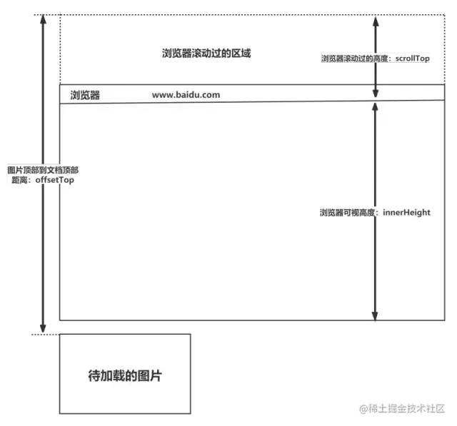
How to tell if an element has reached the visible area
Take the picture display as an example:
-
window.innerHeightis the height of the browser's viewable area; -
document.body.scrollTop||document.documentElement.scrollTopis the distance the browser has scrolled; -
imgs.offsetTopis the height of the top of the element from the top of the document (including the scrollbar distance); -
The content reaches the display area: img.offsetTop < window.innerHeight + document.body.scrollTop;
When does the z-index property fail
z-indexThe usual use is for two 重叠labels, the higher the z-index value, the higher the layer. The z-index positionattribute needs to be relative, absoluteor fixed.
"The z-index attribute fails when:"
-
relativeWhen the parent element's position is , the z-index of the child element is invalid. Solution: Change the parent element position to absolute or static; -
The element does not have a position attribute set to a non-static attribute. Solution: Set the element's position attribute to relative, absolute or fixed; -
Elements have floatfloats . Solution: remove float and change todisplay:inline-block;
What are the properties of transform in CSS3
-
translate displacement -
rotate rotate -
scale zoom -
skew
Common CSS layout units
The "pixel px" 基本 layout unit
"percentage %" is relative to 父元素, 百分比so as to achieve a responsive effect.
"em" is relative to the text of the parent element 倍数. font-sizeRelative to the browser's 默认font size (default 16px) if the parent element is not set .
A multiple of "rem"font-size relative to the root element . Function: Use rem to achieve a simple 响应式layout. You can use the ratio of the font size in the html element to the screen to set the value of font-size, so that the element changes when the screen resolution changes.
"vw:" relative to the width of the window, the window width is 100vw;
"vh:" relative to the height of the window, the window height is 100vh;
"vmin:" the lesser of vw and vh;
"vmax:" vw and vh The larger value of ;
vwThe difference between percentage and percentage is: vwrelative to the viewport, %relative to the parent element
Differences and usage scenarios of px, em, and rem
"The difference between the three:"
-
pxIt is a fixed pixel, once set it cannot be changed to fit the page size. -
emandremare more flexible than px, they are相对length units, their length is not fixed, and are more suitable for responsive layouts. -
em 父元素sets the font size relative to it, so there is a problem, any element setting may need to know the size of its parent element. And rem is relative根元素, which means that only a reference value needs to be determined at the root element.
"scenes to be used:"
-
For those that only need to be adapted to 少部分mobile devices and the resolution has little effect on the page, use .px -
For 各种mobile devices that need to be adapted, userem, for example, devices that need to be adapted to iPhone and iPad with relatively large resolution differences.
How to adapt to the mobile terminal according to the design draft?
Mobile terminal adaptation mainly has 两个dimensions:
"Adapt to different pixel densities" , for different 像素密度, use CSS 媒体查询, select images with different precision, to ensure that the pictures will not be 失真;
"Adapt to different screen sizes" , because different screens have different 逻辑像素sizes, so if you use the pxunit , It will make the developed page can be displayed accurately on a certain mobile phone, but will not be on another mobile phone 失真. In order to adapt to the size of different screens, the content of the design draft should be restored in proportion.
In order to make the page size adaptive, you can use rem, em, vw, vhetc.相对单位
The concept and basic principles of responsive design
响应式网站means a website can 兼容多个终端.
"About the principle:" The basic principle is to detect different device screen sizes through media query (@media) query for processing.
「关于兼容:」 页面头部必须有 meta 声明的 viewport。
<meta name="viewport" content="width=device-width, user-scalable=no, initial-scale=1.0, maximum-scale=1.0, minimum-scale=1.0" />
为什么需要清除浮动?清除浮动的方式
「浮动的定义」:非 IE 浏览器下,容器不设高度且子元素浮动时,容器高度不能被内容撑开。此时,内容会溢出到容器外面而影响布局。这种现象被称为浮动(溢出)。
「浮动的工作原理:」
-
浮动元素脱离文档流,不占据空间(引起“高度塌陷”现象) -
浮动元素碰到包含它的边框或者其他浮动元素的边框停留 浮动元素可以左右移动,直到遇到另一个浮动元素或者遇到它外边缘的包含框。浮动框不属于文档流中的普通流,当元素浮动之后,不会影响块级元素的布局,只会影响内联元素布局。此时文档流中的普通流就会表现得该浮动框不存在一样的布局模式。当包含框的高度小于浮动框的时候,此时就会出现“高度塌陷”。
「浮动元素引起的问题?」
-
父元素的高度无法被撑开,影响与父元素同级的元素 -
与浮动元素同级的非浮动元素会跟随其后 -
若浮动的元素不是第一个元素,则该元素之前的元素也要浮动,否则会影响页面的显示结构
使用 clear 属性清除浮动的原理?
使用 clear 属性清除浮动,其语法如下:
clear: none|left|right|both
如果单看字面意思,clear:left 是“清除左浮动”,clear:right 是“清除右浮动”,实际上,这种解释是有问题的,因为浮动一直还在,并没有清除。
官方对 clear 属性解释:“元素盒子的边不能和前面的浮动元素相邻”,对元素设置 clear 属性是为了避免浮动元素对该元素的影响,而不是清除掉浮动。
还需要注意 clear 属性指的是元素盒子的边不能和前面的浮动元素相邻,注意这里“前面的”3 个字,也就是 clear 属性对“后面的”浮动元素是不闻不问的。考虑到 float 属性要么是 left,要么是 right,不可能同时存在,同时由于 clear 属性对“后面的”浮动元素不闻不问,因此,当 clear:left 有效的时候,clear:right 必定无效,也就是此时 clear:left 等同于设置 clear:both;同样地,clear:right 如果有效也是等同于设置 clear:both。由此可见,clear:left 和 clear:right 这两个声明就没有任何使用的价值,至少在 CSS 世界中是如此,直接使用 clear:both 吧。
一般使用伪元素的方式清除浮动:
.clear::after{
  content: '';
  display: block;
  clear: both;
}
clear 属性只有块级元素才有效的,而::after 等伪元素默认都是内联水平,这就是借助伪元素清除浮动影响时需要设置 display 属性值的原因。
对 BFC 的理解,如何创建 BFC
先来看两个相关的概念:
-
Box: Box 是 CSS 布局的对象和基本单位,⼀个⻚⾯是由很多个 Box 组成的,这个 Box 就是我们所说的盒模型。 -
Formatting context:块级上下⽂格式化,它是⻚⾯中的⼀块渲染区域,并且有⼀套渲染规则,它决定了其⼦元素将如何定位,以及和其他元素的关系和相互作⽤。
块格式化上下文(Block Formatting Context,BFC)是 Web 页面的可视化 CSS 渲染的一部分,是布局过程中生成块级盒子的区域,也是浮动元素与其他元素的交互限定区域。
通俗来讲:BFC 是一个独立的布局环境,可以理解为一个容器,在这个容器中按照一定规则进行物品摆放,并且不会影响其它环境中的物品。如果一个元素符合触发 BFC 的条件,则 BFC 中的元素布局不受外部影响。
「创建 BFC 的条件:」
-
根元素:body; -
元素设置浮动:float 除 none 以外的值; -
元素设置绝对定位:position (absolute、fixed); -
display 值为:inline-block、table-cell、table-caption、flex 等; -
overflow 值为:hidden、auto、scroll;
「BFC 的特点:」
-
垂直方向上,自上而下排列,和文档流的排列方式一致。 -
在 BFC 中上下相邻的两个容器的 margin 会重叠 -
计算 BFC 的高度时,需要计算浮动元素的高度 -
BFC 区域不会与浮动的容器发生重叠 -
BFC 是独立的容器,容器内部元素不会影响外部元素 -
每个元素的左 margin 值和容器的左 border 相接触
「BFC 的作用:」
-
解决 margin 的重叠问题:由于 BFC 是一个独立的区域,内部的元素和外部的元素互不影响,将两个元素变为两个 BFC,就解决了 margin 重叠的问题。 -
解决高度塌陷的问题:在对子元素设置浮动后,父元素会发生高度塌陷,也就是父元素的高度变为 0。解决这个问题,只需要把父元素变成一个 BFC。常用的办法是给父元素设置overflow:hidden。 -
创建自适应两栏布局:可以用来创建自适应两栏布局:左边的宽度固定,右边的宽度自适应。
<div class="left"></div>
<div class="right"></div>

.left{
     width: 100px;
     height: 200px;
     background: red;
     float: left;
 }
 .right{
     height: 300px;
     background: blue;
     overflow: hidden;
 }
左侧设置float:left,右侧设置overflow: hidden。这样右边就触发了 BFC,BFC 的区域不会与浮动元素发生重叠,所以两侧就不会发生重叠,实现了自适应两栏布局。
什么是 margin 重叠问题?如何解决?
「问题描述:」
两个块级元素的上外边距和下外边距可能会合并(折叠)为一个外边距,其大小会取其中外边距值大的那个,这种行为就是外边距折叠。需要注意的是,浮动的元素和绝对定位这种脱离文档流的元素的外边距不会折叠。重叠只会出现在垂直方向。
「计算原则:」
折叠合并后外边距的计算原则如下:
-
如果两者都是正数,取大者 -
如果是一正一负,取正值减去负值的绝对值 -
两个都是负值时,取绝对值大者
「解决办法:」
对于折叠的情况,主要有两种:兄弟之间重叠和父子之间重叠
-
兄弟之间重叠
-
底部元素变为行内盒子:display: inline-block -
底部元素设置浮动:float -
底部元素的 position 的值为absolute/fixed
-
父子之间重叠
-
父元素加入:overflow: hidden -
父元素添加透明边框:border:1px solid transparent -
子元素变为行内盒子:display: inline-block -
子元素加入浮动属性或定位
元素的层叠顺序
层叠顺序,英文称作 stacking order,表示元素发生层叠时有着特定的垂直显示顺序。下面是盒模型的层叠规则:
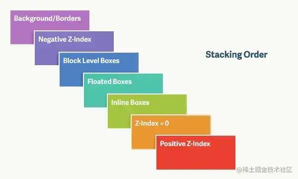
对于上图,由上到下分别是:
-
背景和边框:建立当前层叠上下文元素的背景和边框。 -
负的 z-index:当前层叠上下文中,z-index 属性值为负的元素。 -
块级盒:文档流内非行内级非定位后代元素。 -
浮动盒:非定位浮动元素。 -
行内盒:文档流内行内级非定位后代元素。 -
z-index:0:层叠级数为 0 的定位元素。 -
正 z-index:z-index 属性值为正的定位元素。
::: tip 提示 当定位元素 z-index:auto,生成盒在当前层叠上下文中的层级为 0,不会建立新的层叠上下文,除非是根元素。:::
position 的属性有哪些,区别是什么
| position | 有以下属性值: |
|---|---|
| 属性值 | 概述 |
| absolute | 生成绝对定位的元素,相对于 static 定位以外的一个父元素进行定位。元素的位置通过 left、top、right、bottom 属性进行规定。 |
| relative | 生成相对定位的元素,相对于其原来的位置进行定位。元素的位置通过 left、top、right、bottom 属性进行规定。 |
| fixed | 生成绝对定位的元素,指定元素相对于屏幕视⼝(viewport)的位置来指定元素位置。元素的位置在屏幕滚动时不会改变,⽐如回到顶部的按钮⼀般都是⽤此定 |
| static | 默认值,没有定位,元素出现在正常的文档流中,会忽略 top, bottom, left, right 或者 z-index 声明,块级元素从上往下纵向排布,⾏级元素从左 |
| inherit | 规定从父元素继承 position 属性的值 |
前面三者的定位方式如下:
「relative」:元素的定位永远是相对于元素自身位置的,和其他元素没关系,也不会影响其他元素。
「fixed」:元素的定位是相对于 window (或者 iframe)边界的,和其他元素没有关系。但是它具有破坏性,会导致其他元素位置的变化。
「absolute」:元素的定位相对于前两者要复杂许多。如果为 absolute 设置了 top、left,浏览器会根据什么去确定它的纵向和横向的偏移量呢?答案是浏览器会递归查找该元素的所有父元素,如果找到一个设置了position:relative/absolute/fixed的元素,就以该元素为基准定位,如果没找到,就以浏览器边界定位。如下两个图所示:
display、float、position 的关系
-
首先判断 display 属性是否为 none,如果为 none,则 position 和 float 属性的值不影响元素最后的表现。 -
然后判断 position 的值是否为 absolute 或者 fixed,如果是,则 float 属性失效,并且 display 的值应该被设置为 table 或者 block,具体转换需要看初始转换值。 -
如果 position 的值不为 absolute 或者 fixed,则判断 float 属性的值是否为 none,如果不是,则 display 的值则按上面的规则转换。注意,如果 position 的值为 relative 并且 float 属性的值存在,则 relative 相对于浮动后的最终位置定位。 -
如果 float 的值为 none,则判断元素是否为根元素,如果是根元素则 display 属性按照上面的规则转换,如果不是,则保持指定的 display 属性值不变。
总的来说,可以把它看作是一个类似优先级的机制,position:absolute 和 position:fixed 优先级最高,有它存在的时候,浮动不起作用,display 的值也需要调整;其次,元素的 float 特性的值不是 none 的时候或者它是根元素的时候,调整 display 的值;最后,非根元素,并且非浮动元素,并且非绝对定位的元素,display 特性值同设置值。
absolute 与 fixed 共同点与不同点
「共同点:」
-
改变行内元素的呈现方式,将 display 置为 inline-block -
使元素 脱离普通文档流,不再占据文档物理空间 -
覆盖 非定位文档元素
「不同点:」
-
absolute与fixed的根元素不同,absolute的根元素可以设置,fixed根元素是浏览器。 -
在有滚动条的页面中, absolute会跟着父元素进行移动,fixed固定在页面的具体位置。
对 sticky 定位的理解
sticky 英文字面意思是粘贴,所以可以把它称之为粘性定位。语法:position: sticky; 基于用户的滚动位置来定位。
Sticky positioned elements are dependent on the user's scrolling position:relative, position:fixedswitching between and positioning. It behaves like position:relative; and when the page scrolls beyond the target area, it behaves like position:fixed; , and it sticks to the target position. Element positioning behaves as a relative positioning until a certain threshold is crossed, and a fixed positioning thereafter. This specific threshold refers to one of top, right, bottom or left, in other words, specify one of the top, right, bottom or left thresholds for sticky positioning to take effect. Otherwise it behaves the same as relative positioning.
leader dove
https://juejin.cn/post/7080889197719994375
Reference
https://www.processon.com/view/link/61e668441e085306c9778658:https://link.juejin.cn/?target=https%3A%2F%2Fwww.processon.com%2Fview%2Flink%2F61e668441e085306c977865