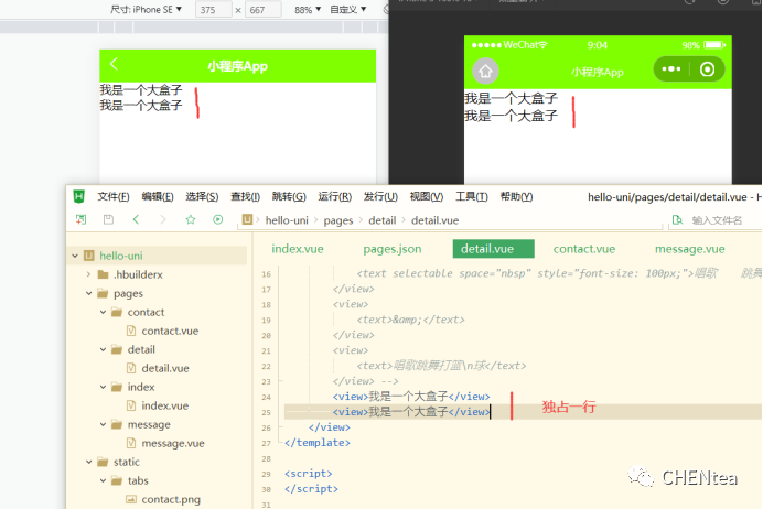
2, the basic use of the view component
|
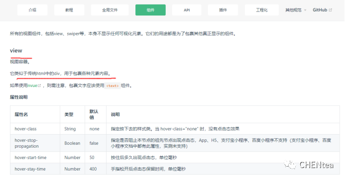
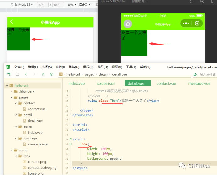
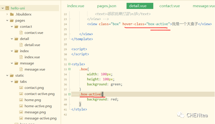
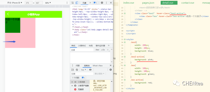
2.1 The hover-class attribute of the <view> component specifies the style class to be pressed. When hover-class="none" , there is no click state effect:
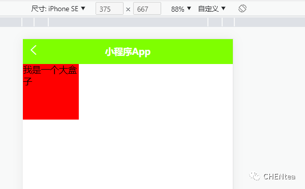
When the mouse is pressed, the box turns red:
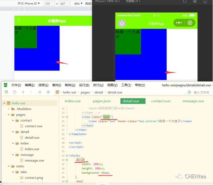
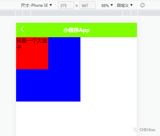
At this time, only the box has the hover-class attribute, and when the mouse is pressed, only the box turns red, and the box2 does not change color; moreover, only the box2 is pressed , and there is no change:
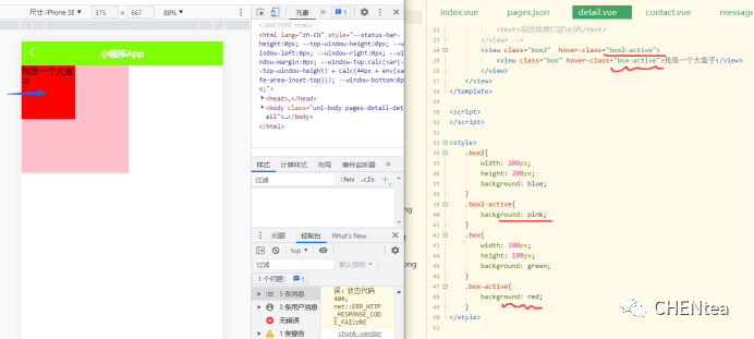
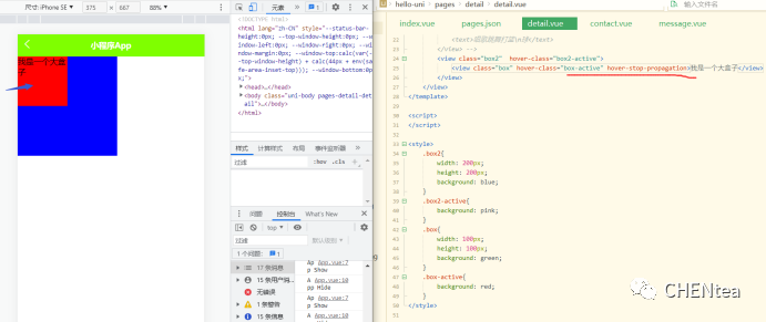
But after adding the hover-class attribute to box2 , at this time, when the box is pressed , both box and box2 change color; however, when only box2 is pressed , only box2 changes color: (event bubbles)
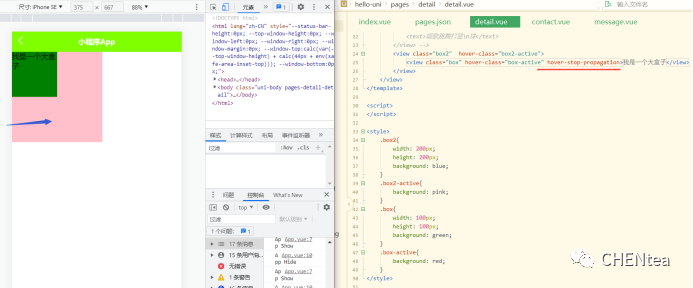
2.2 The hover-stop-propagation attribute of the <view> component specifies whether to prevent the click state of the ancestor node of this node from appearing. App , H5 , Alipay applet, and Baidu applet are not supported (Alipay applet and Baidu applet have both in the documents This property is not supported by the actual measurement)
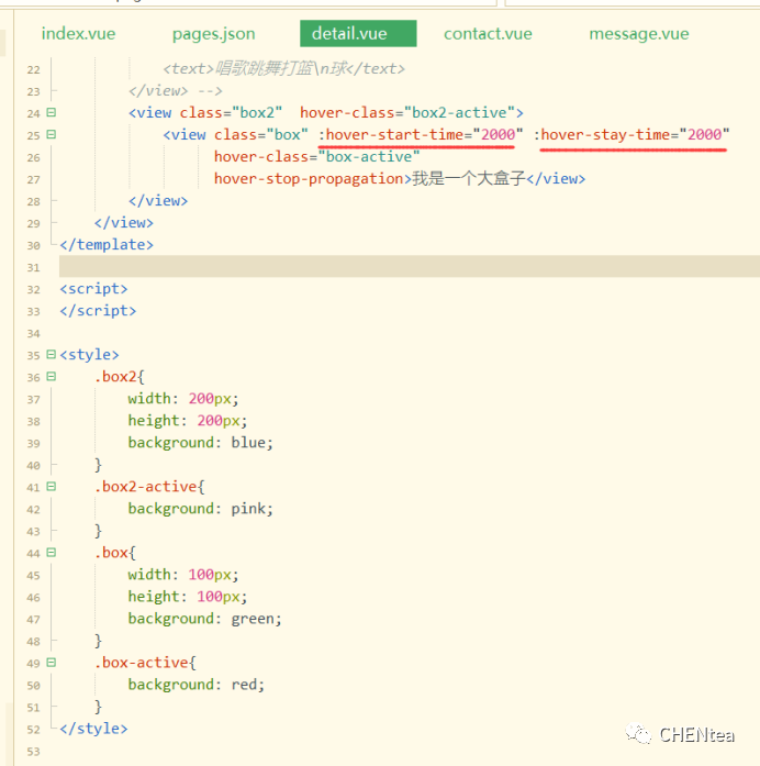
At this point, click on box and box2 , and do not affect each other; (to prevent the event from bubbling). 2.3 The hover-start-time property of the <view> component , how long does the click state appear after being pressed, in milliseconds ; 2.4 The hover-stay-time attribute of the <view> component, the click state retention time after the finger is released, in milliseconds ;
|
3, the use of button button component
|
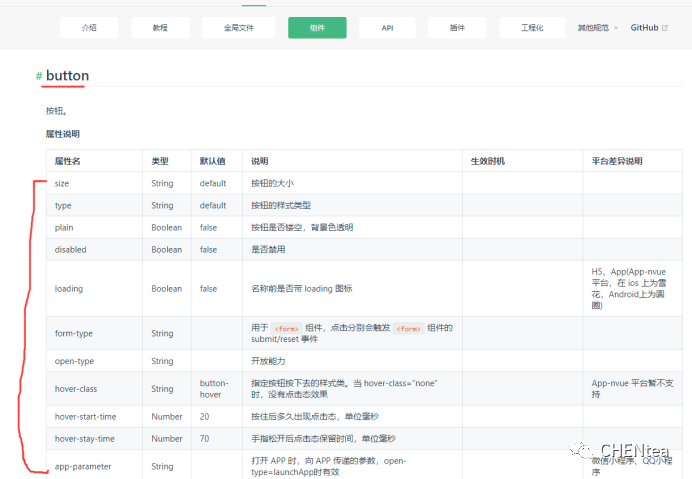
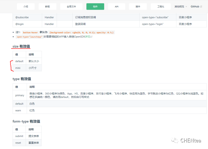
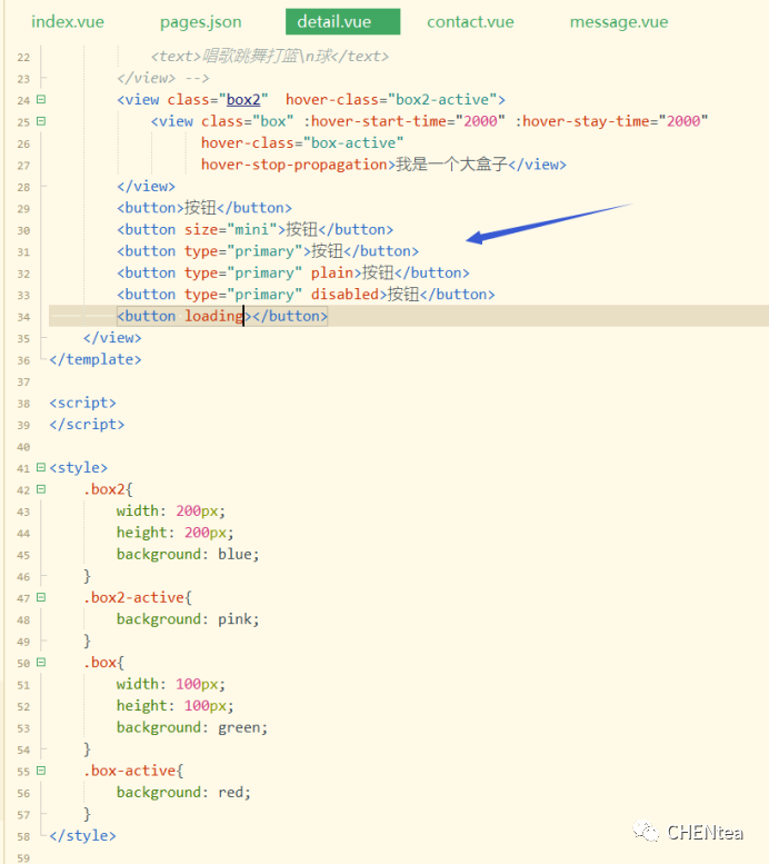
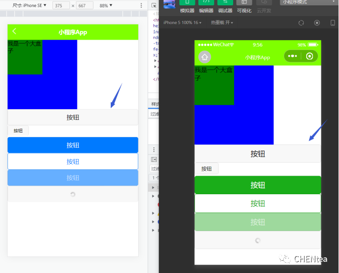
The `button` component occupies a single line by default. When you set `size` to `mini` , you can display multiple on one line :
|
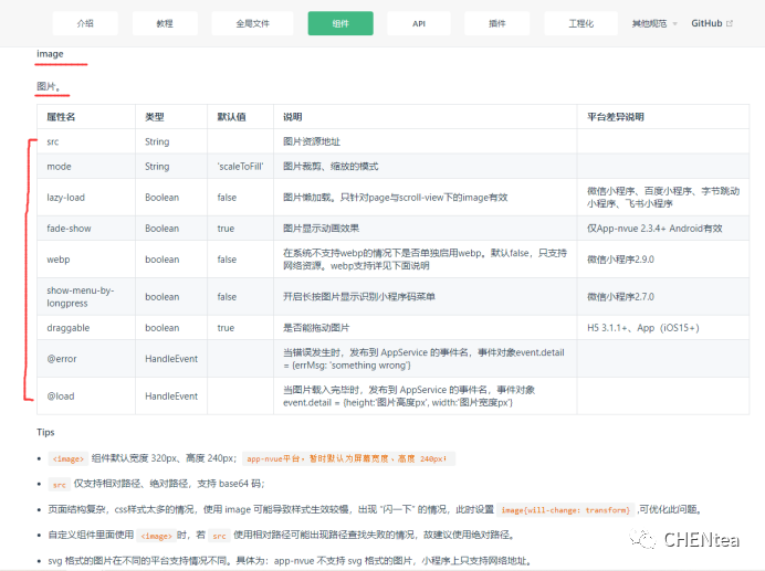
4. Basic use of image components
|
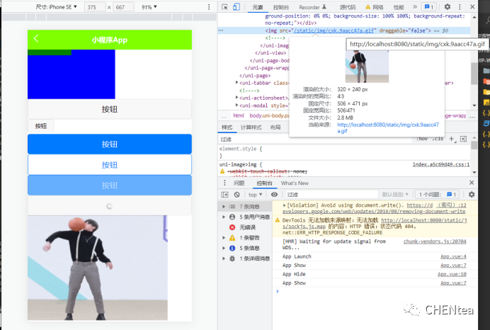
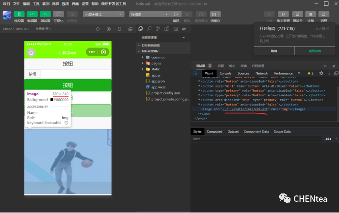
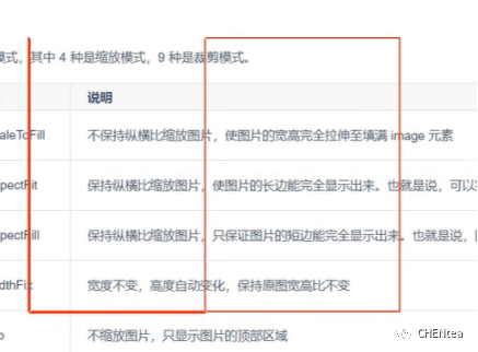
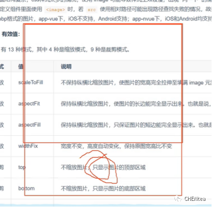
( 1 ) `<image>` component has a default width of 300px and a height of 225px ; ( 2 ) `src` only supports relative path, absolute path and base64 code; ( 3 ) When the page structure is complex and there are too many css styles, the use of image may cause the style to take effect slowly, and there will be a " flash " situation. At this time, setting `image{will-change: transform}` can optimize this problem.
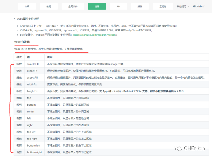
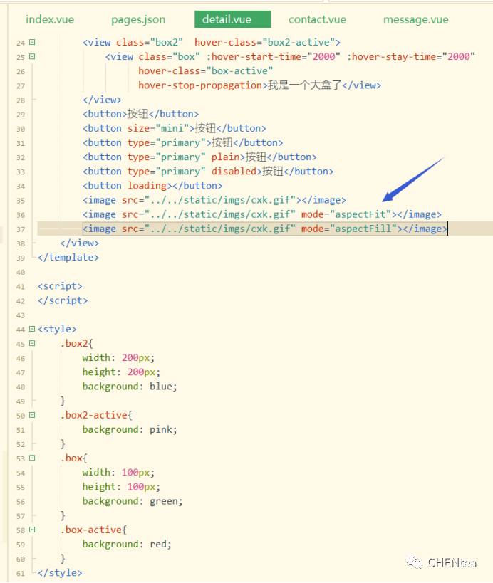
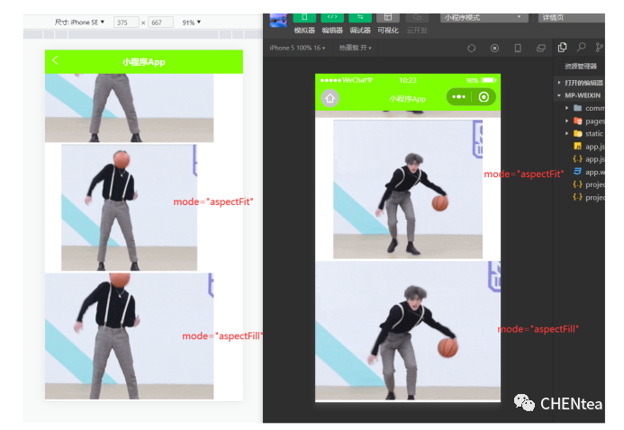
4.1 In the <image> component, mode="aspectFit", keep the aspect ratio and scale the image so that the long side of the image can be fully displayed. That is, the picture can be displayed completely.
4.2 In the <image> component, mode="aspectFill" , keep the aspect ratio and zoom the image, and only ensure that the short side of the image can be fully displayed. That is, the picture is usually only complete in the horizontal or vertical direction, the other direction will be cropped.
|
