 Author: Xiaobei children's shoes
Source: Mango College (ID: lazy_info)
Some time ago, I shared a " project schedule " at the end of the article, and received a lot of comments from small partners. This kind of chart is actually an alternative " Gantt chart ".
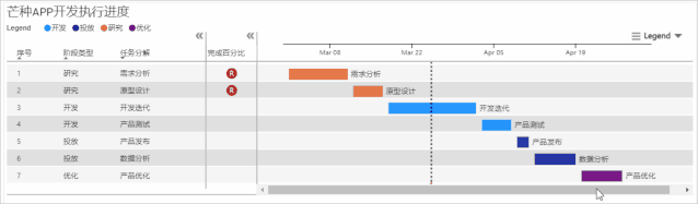
However, traditional Gantt charts generally have progress bars on one side of the X-axis, such as:
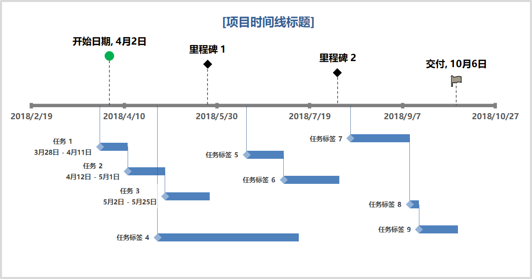
This type of Gantt chart uses a " stacked bar chart " to simulate, so how should an alternative Gantt chart with two sides + milestones be made?
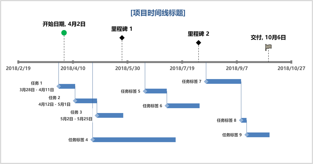
Looks a lot like the bar chart above, but with a more random placement.
And each point can be derived from a horizontal line + a vertical line, in fact, the scatter plot + error bar is used here .
As the scatter chart of the King of Ten Thousand Charts , let's take a look at the skills of using this chart with Xiaobei today~

data preprocessing preparation
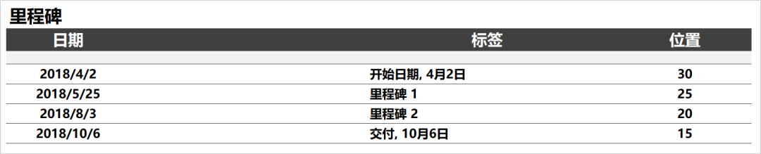
The first is the data preprocessing part. Let's first observe the chart, the most obvious data " date ".
There are two types of dates, the project start date and the project end date .
There is another one that is the Y value of the scatter in the chart , which is the height .
So to sum up, the most basic data fields of this chart are: start/end date, Y-axis height, task name , organized into a table, as follows.
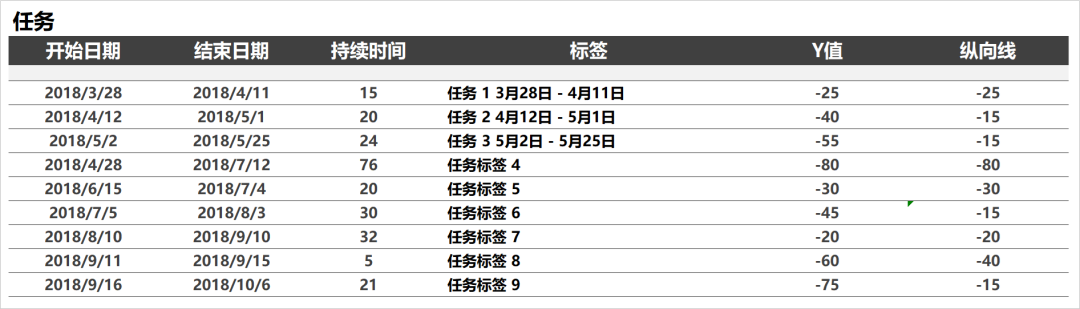
The same milestone data is also very simple, it also includes the date, milestone label, Y value position , as follows.
Now we have preprocessed the data and summarized the preprocessing skills:
-
Think of the start date as the X of the scatter plot, then the height is the Y value;
-
Item duration is achieved with horizontal error bars;
-
The task's associated lines are connected using vertical error bars;
It looks very troublesome, but it is actually very simple. Next, let's try to make a chart.

Scatter chart making skills
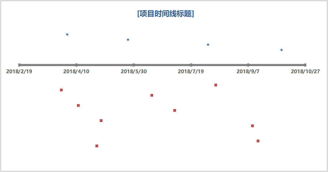
First select XY to draw a scatter plot, that is, " Start Time " and " Y Value ".
And add the " milestone " data to the scatter plot to get the following chart.
Then select the scatter point below, add a " horizontal error bar ", and modify the thickness of the line to 12 points, and select the range of data as " duration ", the effect is as follows.
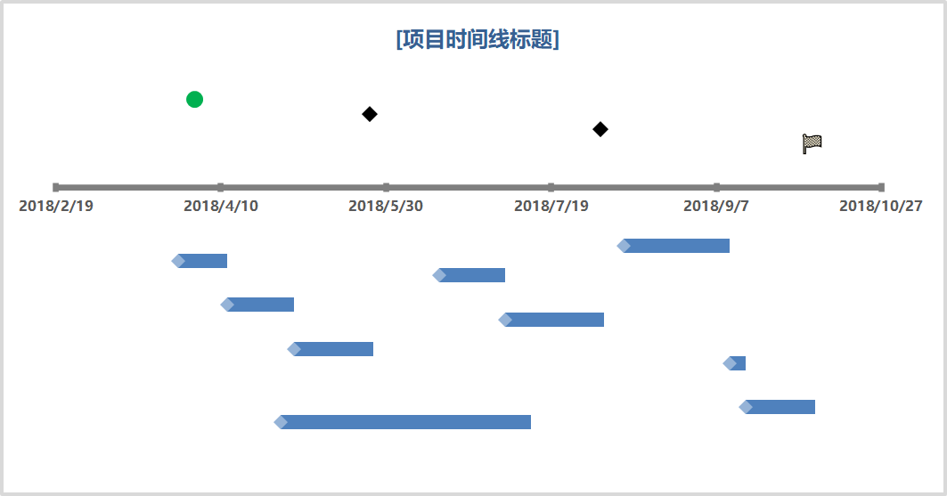
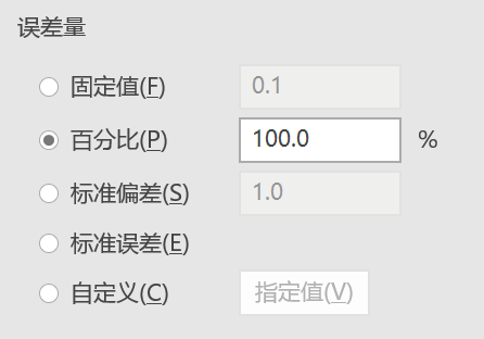
Follow the same technique to add " Vertical Error Bar ", select " Vertical Line ", adjust the line thickness to 1 point, the effect is as follows.
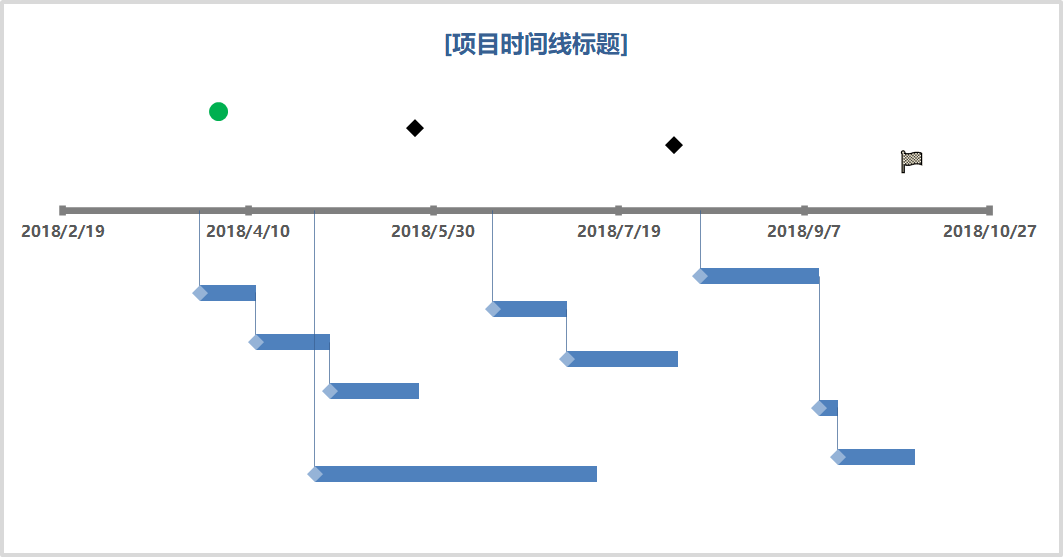
Finally, the " vertical error bars " and " data labels " of the milestones are added directly in the chart.
In addition, the vertical error bar here can be selected as 100%.
Now we can easily use the scatter chart to make a progress timeline (Gantt chart), as follows.
The most difficult part of this project is the data simulation. It is recommended to use pen + paper to simulate the draft completely, so that the Y value part of the scatter will be much simpler.
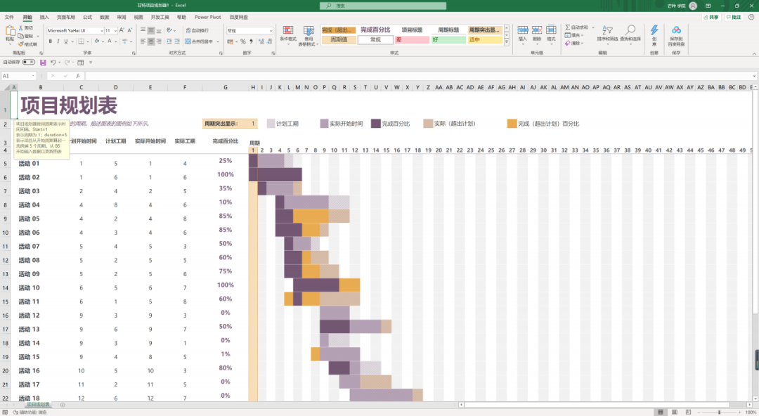
In fact, there are many techniques for making Gantt charts/timelines in Excel.
For example, you can use formula + conditional formatting + cell drawing to get the following effect.
The scatter chart can also be made into a vertical effect, and it becomes a format more suitable for mobile phone reading.
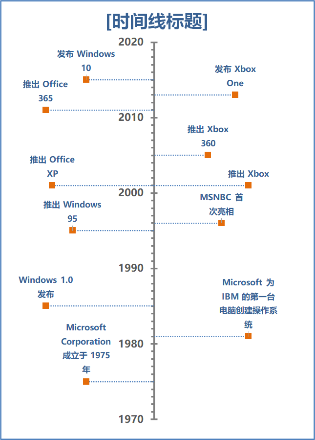
Is the effect great? In addition, these charts are built-in in Excel. In version 2016 or above, you can search when you create a new one~
Ok, so today's " Timeline/Gantt Chart " making tips will be shared here. Isn't it very simple but super practical!
If it is helpful to you, remember to click " Good-looking " . If you have Excel skills you want to learn, you may leave a message below~
Want more ideas and techniques for data manipulation and infographics ? "Excel practical class, let your chart speak " Value Excel course to learn about -